Graphic Title Design
by Jenifer Juris
Learn the do’s and dont’s of creating a project with a large graphic title. It’s sure to give your page a unique look!
Step One: Open a Scrapbook Page
- Open a document (File > Open) that will benefit from a large, graphic title.
Note: Starting this tutorial with a nearly finished scrapbook page or other digital project is recommended. That way, you will have all the elements and photos placed and will be sure there is enough room for a large title.
- Press the letter D to reset the Color Chips to the default of black and white.
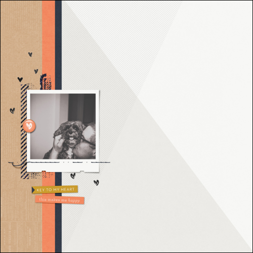
Here is my nearly finished scrapbook page.
Step Two: Choose a Word
This step takes some thought. In order for this tutorial to work as written, you will need a word that has an even amount of letters. I found that six letters works best, but using four or eight letters will still produce a good result.
Some suggestions for a word (in bold) would be:
- Better Together
- Object of my Affection
- Life is Good
- Always and Forever
- Family (plus your last name)
- Mother (plus Mother’s name)
- Father (plus Father’s name)
- Any word that is four to eight letters long
Step Three: Choose a Font and Size
- In the Layers panel, click to activate the layer just below where you’d like to put the graphic title layer.
- Click on the Create a New Layer icon.
- Get the Horizontal Type tool.
- In the Tool Options, choose a font and size. Keep the following rules in mind:
- Rule One: Keep the font simple. Sans-serif is best. Avoid fancy fonts.
- Rule Two: Keep the font heavy. Avoid thin fonts.
- Rule Three: Keep the size large. Start with 200 pt and adjust later.
I’m using Avenir Next Condensed Bold at 235 pt.
Step Four: Type the Word
- On the document, click and start typing the first two letters of the word you chose in Step Two.
- Hold down the Ctrl key (Mac: Cmd key) and click and drag inside the bounding box to move the letters into a position that makes the most sense for your design. See the screenshot below.
- Click the check mark to commit the type.

Note: Putting each line of letters on their own layer is important. This gives you total control of the spacing in between the lines that will compose the graphic title.
- Make sure you have the Horizontal Type tool.
- On the document, hold down the Shift key and click and start typing the next two letters of the word.
- Reposition the letters using the previous instructions.
- Click the check mark to commit the type.
Note: Holding down the Shift key will enable you to create a new type layer without accidentally selecting the type layer you just created.
- Repeat the process for the rest of the word making sure there are only two letters per line (type layer).

Step Five: Align the Word
- Get the Move tool.
- In the Layers panel, click to activate the layer that contains your first two letters of the word. I will click on the Type layer containing the B and E.
- In the Layers panel, hold down the Shift key and click on the layer containing the last two letters of the word. I will click on the Type layer containing the E and R. Now all Type layers used in the word should be active.
- In the Tool Options, click on the Distribute Vertical Centers icon. This will make sure the spacing between each line is the same.
- Click on the Align Horizontal Centers icon.
Additional Alignment (optional)
Due to the different widths of different letters, Align Horizontal Centers doesn’t always produce the best result. If you feel that the word could use additional adjustment, follow these steps:
- In the Layers panel, click to activate only one of the Type layers.
- Press the Arrow keys to nudge the layer left or right so that it appears to be centered.

Step Six: Resize the Word
- Using the same instruction as before, in the Layers panel activate all the Type layers associated with the word.
- Press Ctrl T (Mac: Cmd T) to get the Transform options.
- To make the letters bigger (or taller), on the document click and drag from a corner handle to resize the type until it’s the size you want. (Photoshop: Hold down the Shift key while dragging.)

- To make the letters wider, click and drag from a side handle of the bounding box.
- Click the check mark to commit the changes.

Step Seven: Recolor the Letters
- All the Type layers in the Layers panel should still be active.
- Get the Horizontal Type tool.
- Click on the Foreground Color Chip to open the Color Picker.
- In the dialog box, choose a color that compliments your scrapbook page and click OK.
So that it doesn’t overpower your page, I recommend using as light a color as possible, but make sure it’s still easily visible. I’m using Hex #d6d5d3.

Now your layout is ready for you to finish off your title. I recommend using a thin, scripty font to compliment your bold graphic title. I used the font Bellwethers for the word “together.”
Here is my completed scrapbook page:

I hope this inspires you to jump in and create your own page with a large, graphic title! Please share your creations in the Digi Scrap Tutorial Gallery.
Credits:
Page & Photo: Jenifer Juris
Tutorial: Graphic Title Design by Jenifer Juris
Kit: Love List by One Little Bird
Fonts: Avenir Next, Bellwethers

_____________________________________________
 Author: Jenifer Juris | Contact Us
All comments are moderated.
Please allow time for your comment to appear.
Leave a Reply