Quick Text Box Alignment Quiz
by Jen White
Ready to test your skills?
Look at the three journaling cards below.
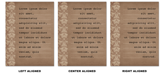
When adding journaling to this particular style of card, should you…
- Use a left alignment?
- Use a center alignment?
- Use a right alignment?
ANSWER
The text on the above journaling card should be left aligned.
Why?
Alignment is an extension of the basic design concept of Proximity. It has to do with placing items so they line up, which in turn creates an organized grouping.

• The journaling card on the left includes a coordinating strip of paper up the left side (indicated by the red box). Because the strip is there, the text needs to align to it.
• The journaling card in the middle has no strip, therefore, center alignment is acceptable. In fact, any of the three alignment choices would work for the center card.
• The journaling card on the right includes a coordinating strip of paper up the right side (indicated by the blue box). Now the text must be aligned to the right in order to maintain proximity.
Remember, Avoid Trapped Space!
Any time you see the term “proximity”, you should always expect the concept of “trapped space” to be brought into question.
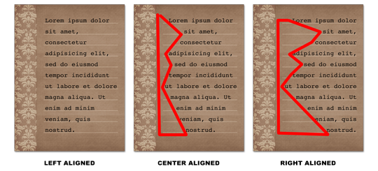
In the original cards (above), the center and right aligned cards are incorrect because they’re inviting trapped space into the design . . . a big no no. I’ve drawn a red marker around the trapped space to clearly point it out.

Ready to learn more about the hows and whys of beautiful scrapbook pages?
It all has to do with seven basic design principles, which when explained in practical terms, anyone can learn, understand, and apply.
Learn more about Design Beautiful Pages.
_____________________________________________
 Author: Jen White | Contact Us
All comments are moderated.
Please allow time for your comment to appear.
8 Responses
Nell
I knew you would say the left was correct, but I really prefer the center most of the time. I guess I’m weird because I see the trapped space as part of the design. I usually look at all 3 choices and then just pick which ever looks best to me in that particular situation. Maybe not the correct way, but it works for me 😊. Thanks for the lesson review. I’ll have to keep it in mind for those times when I can’t decide which I like best!
Nyla Baker
The right answer appealed to me–I just didn’t know why.
Now I know! Maybe it is because I am taking the
Design Beautiful Pages class.
Thank You
Donna
This was such a great explanation. I think I need to cut this out and place near my computer. Thanks, Jen.
Beverly Thiels
Ah, pat myself on the back – for once I got the answers right. You must be teaching me something. 🙂
Thejage
I agree with Jodi …. very helpful!
Lori
Fantastic tip and I LOVE the visuals to reinforce the points. Thank you!
Jessie
I’m loving this class. Didn’t even think about alignment and trapped space on a journaling card. Makes sense. Thanks! 🙂
Jodi Watson
Thank you, this was very helpful!!