![]()
Tricky Transparency, Part One
Complex Photo Mask Potential
by Jen White
Train your eye to spot a potentially great complex photo mask. In Part One of my Tricky Transparency series, I’ll show you how to pick out maximum potential for a complex photo mask for your next digital project.
Part One includes:
- Defining a Complex Photo Mask
- 4 Characteristics of a Potentially Good Complex Photo Mask
- How to “See” a Complex Photo Mask Without Color
For this tutorial you will need:
- A computer program capable of desaturating an image, like Photoshop Elements or Adobe Photoshop
- A small assortment of masks (download the examples I’m using–7MB)
Defining a Complex Photo Mask
The term “photo mask” is a very broad term. In the digital world, a photo mask anything you clip a photo to.
To learn more about clipping basics, check out our FREE class: The Fundamentals.
Most generally, a photo mask is simply a shape like these that you can clip a photo to:
![]()
But in this tutorial series, I’ll be talking about complex photo masks that look like this:
![]()
4 Characteristics of a Potentially Good Complex Photo Mask
-
Characteristic 1—White or Transparent Background
When looking for a potentially good complex photo mask on the web (more about where to look in Part Two of this series), or even when looking for one in your own stash, the very first thing you need to be aware of is the background.
The three images below have bad potential. Why? The background behind the shape (potential complex photo mask) is not white or transparent.
Note: The gray outline represents the image’s boundaries.
![]()
- The first example has a GREAT shape in the middle of it, but the background is orange polkadot. Bad potential.
- The second example also has a great shape in it. It may or may not matter that there is a photo already clipped to the shape. What does matter is that the background behind the shape is lavender. That makes this example have bad potential.
- The third example might look promising, but the background behind the green shape is not actually white, it’s a textured white paper. The texture of the white paper is going to complicate things. So, this is also an example with bad potential.
The three images below have good potential. Why? The background behind the shape is white or transparent.
Note: The gray outline represents the image’s boundaries.
![]()
In all three images above, the shape (potential complex photo mask) is surrounded with white or transparent pixels. When you see this, you’ve found an image with great potential to be a complex photo mask.
TAKE QUIZ #1 — Which of these images (below–example1, example2, example3) has good potential and which has bad potential?
To take a closer look, you will find these example images in the download offered above.
ANSWERS: You’ll find the answer to the quizzes at the bottom of this tutorial.
![]()
-
Characteristic 2—Varied Edges
When I say “edges,” I’m referring to the perimeter of the shape (potential complex photo mask).
In the image below, I drew a red line to indicate the basic edges of this shape. Notice how they appear very random or varied. There is no symmetry or straight lines.
For an image or shape to have potential to be a good complex photo mask, it should have varied edges.
![]()
TAKE QUIZ #2 — According to varied edges, which of these images (below–example4, example5, example6) has good potential and which has bad potential?
To take a closer look, you will find these example images in the download offered above.
ANSWERS: You’ll find the answer to this quiz at the bottom of this tutorial.
![]()
-
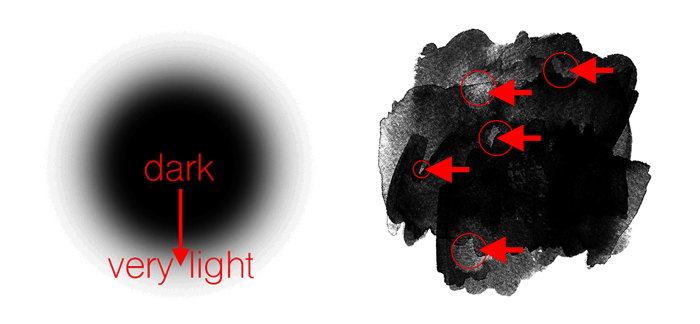
Characteristic 3—Varied Saturation
This characteristic is all about how dark or light the pixels are within the complex photo mask. It doesn’t matter what color the pixels are (here they are shades of gray), it only matters how dark the color is.
- Dark pixels will be less transparent (less see-through) in a complex photo mask.
- Light pixels will be more transparent (more see-through)
The more range of dark pixels to light pixels (remember, color doesn’t matter) you have in a complex photo mask, the better it will look when a photo is clipped to it.
![]()
How to “See” a Complex Photo Mask Without Color
THE SEEING TEST
To get a better idea of the saturation levels (dark to light) in a potential photo mask, put it to the test. This test is especially helpful for multicolored masks.
- Open a potential photo mask (File > Open).
- In the Layers panel, click on the Create New Fill or Adjustment Layer icon and choose Hue/Saturation.
- In the Hue/Saturation panel, click and drag the Saturation slider all the way to the left.
Does the image have a good variety of saturation? Does it contain dark grays, medium grays, and light grays? If so, then it has varied saturation.
- When finished, close the image without saving.
TAKE QUIZ #3 — According to varied saturation, which of these images (below–example7, example8, example9) has good potential and which has bad potential? Try putting example9 to the Seeing Test above to get a better idea of what it looks like.
To take a closer look, you will find these example images in the download offered above.
ANSWERS: You’ll find the answer to this quiz at the bottom of this tutorial.
![]()
-
Characteristic 4—Varied Insides
This characteristic is not nearly as important as the first three, but it can make a big difference.
- In the example on the left (below), the pixels go from dark to light symmetrically. The result is very dull.
- In the example on the right, there are areas of light pixels mixed in with areas of dark pixels.
Get Ready for Part Two
With these four characteristics in mind, take a travel through your stash and see what you can come up with.
- Make a folder on your desktop called “Complex Photo Masks.”
- Copy and paste any potentially good masks into that folder.
In Part Two of this series we’ll explore more places find potentially good complex photo masks.
Then in Part Three, we’ll take a look at the key to a good complex photo mask—transparency.
All that and much more is coming up. See you in Part Two.

QUIZ ONE Results
![]()
Example1: It has good potential The pixels around the shape (gold paint) are transparent, although they may look white to you in this blog post.
Example2: It has bad potential. The pixels around the shape (the blue gray paint) are cream colored. You could make this into a complex photo mask, but the process would be very complicated.
Example3: It has good potential. The pixels around the shape (rainbow watercolor) are white. It doesn’t matter that parts of the shape go off the sides of the image. This would make a great mask for a greeting card.
QUIZ TWO Results
![]()
Example4: It has bad potential. The symmetry in the shape makes it a bad (dull looking) complex photo mask.
Example5: It has good potential. The edges are extremely varied.
Example6: It has good potential. The edges are extremely varied.
QUIZ THREE Results
![]()
Example7: It has bad potential. It only has one level of saturation.
Example8: It has good potential. There are multiple levels of saturation, dark through light.
Example9: It has good potential. There are multiple levels of saturation. A lot of the mask is white, but we’ll see in Part Three why that doesn’t matter.
Learn designer secrets for the
artistic creation of complex masks.
Save 15% on Brushability: Making Masks

____________________________________________
 Author: Jen White | Contact Us
All comments are moderated.
Please allow time for your comment to appear.
30 Responses
Marie
I could not ask foe a better teacher. You’ve got it girl!😊
Doris
This is wonderful!!!!!!! Thank you.
zita B
Thanks! great tutorial..
Leslie Ann Sartor
Jen, this is great. Not only shows us how to cull our stash for the right mask but the beginnings of how to make one, which is an huge interest of mine. Thanks.
Mrs AA Fourie
Thank you for a great tutorial on masks….loved it!
Donna Juergens
What a great exercise in picking out masks! Thanks, Jen.
Ricki Vaughn
Thanks Jen! I am sure I will be using photo masks more now.
Kim
This is awesome! Looking forward to part 2. Jen, you have a great way of teaching.
Catherine
Thank you Jen. That was a good tutorial. Brought back a lot of memories as I have not been scrapping for a while. Has perked up my interest. Thanks
Cathy L Vernon
Awesome tutorial. Look forward to the next session in the series.
SuZan
Excellent tutorial! Thank you!!!
Deborah Wagner
This was great! I look forward to the rest of the series. Thank you.
Lynne
As usual Jen is awesome. Loved it. I love masks and usually just muddle around without knowing how, why, or what. Now I have a clue, Thanks.
Jean
Thank you. Enjoyed this session very much and am looking forward to next week.
LeeAnn
Thank you so much for helping me to understand complex masks!
Julie LaPoint
Thanks so much, Jen! What a great topic! 🙂
Ruth Everson
Loved it all!
shirley
Thank Jen for this awesome lesson on photo mask. I am looking forward to part 2.
Woodie Sprague
Always fun to re-visit topics and you do a fabulous job teaching us! Thank you for sharing!
Barbara
Love masks! Thanks for all the info so far and looking forward to trying all the ideas and seeing what else is to come.
Enjoy all your classes Jen.
Therese Arsenault
Thank you. One day I hope to master and understand PSE.
Jen White
I’d be honored to help you painlessly through that process, Therese. Let me know when you are ready and I’ll help you get started. 😀
Jen White
NOTICE: There was a problem with the download folder for this tutorial.
As of July 24, 2018, 10:30 AM Eastern, the contents of the folder has been altered.
If you downloaded the folder before this time, please download it again. Thanks!
Carol
Jen – this was great. Very clear and concise! Thank you for the samples and the time it took to make this great tut.
Bonnie
Thanks Jen, simple and easy to follow, no questions here. I got it and that is saying a lot lol lol
Rossie
Jen many thanks for running this free course . Ever so helpful to new digital scrappers!
Jeannie Root
That was really good! Thank you!
Lori
I really enjoyed all these tips and examples–thank you! The only thing I would suggest is putting the quiz answers closer to the question or to repeat the questions right by the answers. It was kind of annoying to scroll back and forth because they were so far apart.
Jen White
HA. Thanks for the suggestion, Lori. I’ll make a note to figure out a better solution! 😀
Julie Singco
What a great series topic! Digital Scrapper never ceases to amaze me with the quality of your products whether it’s a blog post or a class we pay for. Well done! Now I’m off to look for masks.