Learn how to quickly create a title that adds some punch to your scrapbook page.
Step One: Prepare Your Workspace
- Create a new 4×6 inch document (File > New > Blank File) at 300 ppi with a white background. (PS: Choose File > New.)
- Press the letter D to reset the Color Chips to black over white.
Step Two: Create a Title
- Get the Horizontal Type tool.
- In the Tool Options, open the Font Picker and choose a font. Set the Size to 60 pts and the Align to Center.
Note: This technique works best with a font that has thicker letters. I’m using the Sea Salt font.
- On the document, click once in the center and type a title.
- Click the checkmark to commit.

Step Three: Add the Two Tone Style
Photoshop Elements Only:
- In the Menu Bar, choose Layer > Layer Style > Style Settings.
- In the Style Settings dialog box:
- Set the Lighting Angle to 120˚.
- Click to check Drop Shadow.
- Set the Size to 0 px.
- Set the Distance to 14 px.
- Set the Opacity to 100%.
- Click on the Color Chip to open the Shadow Color Picker. Choose a color other than black and click OK to close the Color Picker. I’m using Hex #: 3ad0fb.
- Click OK to close the Style Settings dialog box.
Photoshop Only:
- In the Menu Bar, choose Layer > Layer Style > Drop Shadow.
- In the Layer Style dialog box:
- Set the Blend Mode to Normal.
- Click on the Color Chip to open the Shadow Color Picker. Choose a color other than black and click OK to close the Color Picker. I’m using Hex #: 3ad0fb.
- Set the Opacity to 100%.
- Set the Angle to 120˚.
- Set the Distance to 14 px.
- Set the Spread to 0%.
- Set the Size to 0 px.
- Click OK to close the Layer Style dialog box.
Note: Make sure to keep the settings as I have them here. If you don’t, you may end up with a shadow that doesn’t work. This technique works best with a sharp shadow, not a soft one. The only setting you may need to adjust is the distance. Depending on the font you use, you may need more or less distance to get a similar look to the one I have.

Step Four: Use in a Project
Whether you want to use this title to make a card, word art, or other digital project, you’ll need to move it to another document. Here’s one way you can do that:
- (Optional) Save this document (File > Save As) as a PSD file with a unique name.
- Get the Move tool.
- On the document, click directly on the title and drag it to a different document.
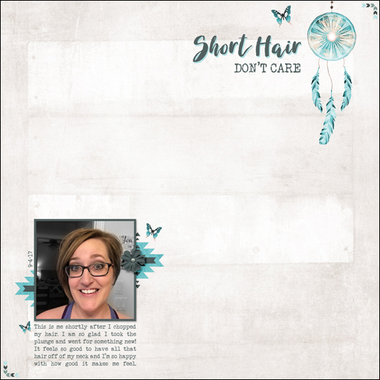
Feel free to change the color of both the type and the shadow so that the colors compliment your project. I used this title on a scrapbook page I made about my recent hair cut.
Credits:
Page & Photo: Jenifer Juris
Tutorial: Two Toned Title by Jenifer Juris
Kit: Mojave by Jennifer Ziegler
Fonts: Veteran Typewriter, Sea Salt
I hope this inspires you to have some fun with your title on your next scrapbook layout!

_____________________________________________
 Author: Jenifer Juris | Contact Us
All comments are moderated.
Please allow time for your comment to appear.
13 Responses
CrimsonCrow
GREAT haircut. Fun Tutorial.
Jenifer Juris
Thanks!! 🙂
zita B
Thanks for the Quik tip. Liking the new cut 🙂
Jenifer Juris
Thanks so much! 🙂
Roberta Corson
What a cute haircut. Your face is beautiful no mater how you wear your hair, but this is just great fun and pretty. So is the page.
Jenifer Juris
Wow! Thank you so much – you’re too sweet!!! 🙂
JanRene Ashman
Great tip and cute hair!
Jenifer Juris
Thank you much!! 🙂
Jenifer Juris
Thank you so much!! 🙂
June
Hair looks great and the page does too. LOVE the title work!
Jenifer Juris
Aw, thank you so much! 🙂
Barbara
Hair looks GREAT Jenifer. Thanks for the info.
Jenifer Juris
Thank you SO much!! 🙂