
From Plain to Fancy — Quick Letter Switcheroo
I will often use two different fonts in the completion of one title. But, it rarely occurs to me to try using two fonts in the completion of word.
If you are looking for something that will jazz up your next scrapbook page without much effort, this tip might be just what you need.
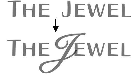
Try replacing just one letter (usually the first letter) in your title with a fancier font. It’s an easy concept to grasp, but there is a trick to it that will help things flow better.
- Type out a title.
- Mask away the letter you wish to replace. Learn about layer masks.
- Type the replacement letter on a new layer and move it into position.
Here’s how that would look in the Layers panel.

Font Credits: Aristelle Sans, Snell Roundhand
_____________________________________________
 Author: Jen White | Contact Us
All comments are moderated.
Please allow time for your comment to appear.
3 Responses
Susan Clark
I think this is just what I needed for a current project.
Thank you for making it so simple!
Joyce
What a great idea! Thanks, Jen
Gail Robb
LOVE this idea – thank you!