 Let’s Get Inspired – June 2017
by Jenifer Juris
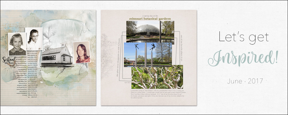
Even though our regular monthly scrapbooking challenge has been suspended until September, we wanted to continue to bring you monthly inspiration from our Creative Team.
This month, we asked the team to create a page about their favorite place(s). I’ve picked a handful of them to showcase here. We hope these pages inspire you to make a page yourself about your favorite place or places.
A Beautiful Place by Donna:
This page by Donna is a classic! The photos are of great quality with good exposure and lighting. Notice how the gray rectangle frames behind the photos help lead your eyes from the top of the page to the bottom. The other small touches, like matching the title to the colors in the photos and using a neutral background, help pull this page together, and, while it’s simple, it’s classically beautiful!
10 Places to Visit by Lori:
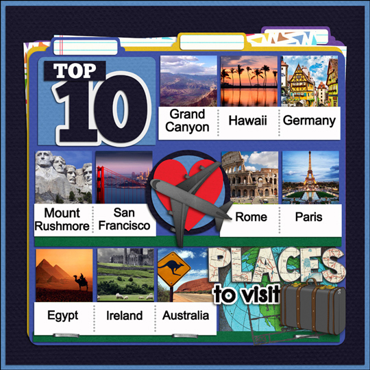
Lori created a really fun page! She took the idea of favorite places and decided to make a page about the top 10 locations she wants to go. Using a grid layout worked in her favor. Her diagonal flow from top-left to bottom-right draws your eyes across the page. The many layers of paper tabs help add dimension, and the added elements pull her layout’s theme together.
Kananaskis Country by Renee:
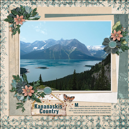
Renee put together this beautiful layout. Here’s what makes it so special. First of all, that photo! It’s a beautiful location and the photo shows the lake and the neighboring scenery in such a good way. She did a fabulous job with her element clusters, too. The shadows are good, and using 3 main clusters creates a visual triangle that helps bring our eyes around the page. The paper choices are great, too, as they don’t take away from the main subject, the photo.
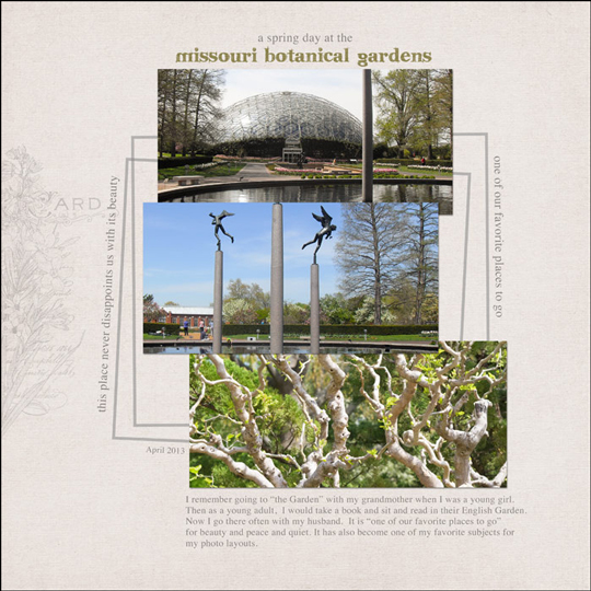
Favorite Place by Terri:
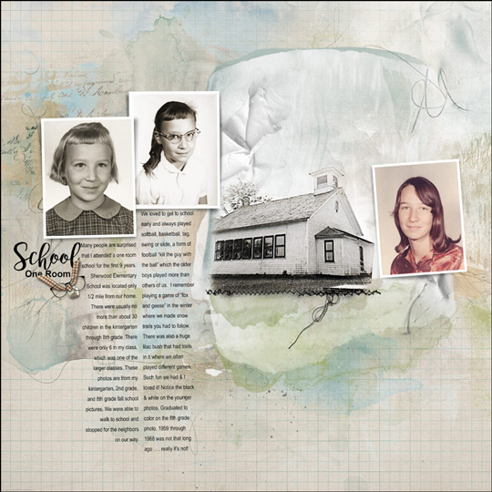
Terri made this wonderful scrapbook page sharing a favorite place of hers from her childhood. Her use of a mask to blend the photo of the school house worked so well here! Using custom shadows on the other photos, as well as giving them each a white stroke outline, set the other photos apart from the rest of the page. The placement of the journaling and the title, being in close proximity to the photos, help keep the eyes focused on the main event (the photos).
Let’s Go by Vynette:
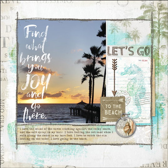
Vynette really wows us with her beautiful page. What a photo! The use of a great photo always improves the overall design of a page and this one is no exception. The soft color palette plus all of the wonderful beachy elements emphasize that the beach is her favorite place to be.
Now we ask, what’s your favorite place? Let us know in the comments. We hope these pages have inspired you to scrap your own page about your favorite place. If so, feel free to link to it in the comments below so we can see it!
Stop avoiding bold and busy backgrounds and start
using them with skill and confidence.
Save 15% on Taming Bold & Busy Backgrounds

_____________________________________________
 Author: Jenifer Juris | Contact Us
All comments are moderated.
Please allow time for your comment to appear.
Leave a Reply