Caution: Things in this image may appear larger than you are comfortable with. In fact, you should be uncomfortable with their size. Let me explain. . . .
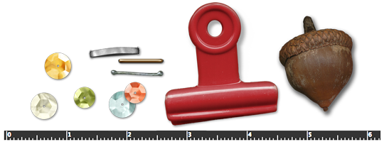
Believable Tip #1: Watch the Ruler
Designers create elements extra-large on purpose. They want you to have options without sacrificing clarity. It’s a good thing!
Take these staples, for example. Three staples from three different designers. All three came onto my page measuring larger than ¾”. A standard staple is ½”. And, if we had acorns that big at my house, I’d sector off the side lot and start charging admission.
What’s a girl to do? Many embellishments need to be sized down after being added to your scrapbook page. Making your embellishments closer to in-real-life size will make your layout more believable. A more believable page makes for a more relaxed viewer.

Believable Tip #2: Mission Impossible
One of these things is not like the others. One of these things just doesn’t belong. Once you finish humming this popular Sesame Street jingle, feel free to blurt out the answer! I know you want to!
Time’s up. It’s the Easter bauble. You know that epoxy thing-a-ma-jig. Why is it different? Well, in-real-life I cannot stitch through un-stitchable things. This generally includes wood, plastic, metal, and most embellishments that are not meant to lay flat on your scrapbook page.
What’s a girl to do? Don’t stitch on top of them! Haha. That cute Easter bauble should be on top of the stitching, not below it. This guideline does not apply just to stitches. I wouldn’t be able to staple that bauble down either!
I’d love to know what YOU think makes an embellishment appear more believable on a scrapbook page. Or maybe you don’t fret about believability like I do? Share your thoughts! We can all learn from each other. 😀
![]()
Jen White
jen@digitalscrapper.com
Credits:
Sequins & Staple from Taking Time to Relax by Eva Kipler
Staple from Carefree by Amanda Heimann
Staple from Photographie by Joanne Brisebois
Acorn from Autumn Days by Kristin Cronin-Barrow
Clip from Our Holiday by Shabby Miss Jenn
Easter embellishments from Hop Along by Penny Springmann.
Learn how to design beautiful pages you LOVE!
Save 15% on Design Beautiful Pages
18 Responses
SHIRLEY KIMBROUGH
I agree with the flowers overtaking a page smothering, uh surrounding a tiny/large frame photo. I am a learned scrapper so my layouts will be more simplistic. I can’t wait until Jen, our Guru, discuss paper choices within a kit. 🙂
Judy A.
Christine, historically photos were not the only thing to be included in scrapbooks. The archives of the Naperville Historical Society have some amazing examples of scrabooks from the early 20th century from young women attending North Central College. One book includes things like a glove worn to a formal dance, pressed flowers, a balloon used at a local event, and yes, buttons — from a favorite dress. One thing the book does not contain is photos. another scrapbook in the collection consists of scraps — of FABRIC. The book belonged to a local quilter and dressmaker, who kept a book full of swatches and notes on the items that required the fabrics. Sometimes the doodads serve a purpose or capture a memory in a way that a photo alone can’t manage.
PatriciaD
All the comments are wonderful and I find myself agreeing with a lot of it. I cannot figure out why so many kits have flowers and buttons and lots of them and not much else but maybe a bit of lace. This is not a well thought out kit and I don’t want to use one like that. It has become my own personal pet peeve. To me…a kit should have a theme not just a color theme. Is it about pets, travel, moms, kids, school, a country, the country, and maybe even flowers but my goodness not just a few flowers a few buttons and call it done. OK, I’ve vented and now I’m done.
I do like to learn how to make my pages look more realistic with stitches where stitches belong, staples and the like but sometimes I just want to get it done and if I like it and it doesn’t have all the right shadows, etc…I guess that’s OK, too!!
Terri
I find it hard to believe that a photo placed over a large embelishment still lays flat. If you put a flower under a photo in real life there would be a lump, curl, or something but certainly not flat. I am not good enough with shadows etc to make it believable, so I don’t even try bulky elements under photos. In real life that rose, flower or whatever would be over the top of the photo edge. Just a thought.
Rose Leontini
Jen, I love you, you have such a sense of humor. Your projects and tips & ricks are so helpful, and your instructions make it so easy to do.
I agree with Jayleigh about your pictures looking off the page. I posted a layout that this was brought up to me and when I flipped the photos my LO looked so much better.
I think the most important check you give your LO before you print or post is DROP SHADOWS. They make your elements look dimentional and real.
Christine
I’m one of those minimalistic designers/scrappers. Less is more and even more less is beautifully according to Christine’s book ‘How To Scrapbook Without Flowers and Thingies’.
I struggled with that. In a previous comment about fonts I mention I went to the academy for graphic design and learned that an element placed on a page should have a function. Placing a flower here a button there goes against everything I have ever learned.
When I rolled into digital scrapping a year ago, I asked myself(and no one else) why a button? What does a button have to do on a scrap page? Was there historical seen once a scrapper who said, we’re out of flowers lets use up the old buttons? It has to be something like that or it doesn’t make sense to me. 🙂
And while I’m on it, there is another thing that bothers me and I will avoid kits that have one. Why do some kits have a Bingo card? Again, this does not make sense to me. In Europe where I was born and raised Bingo is seen as some silly game real old timers play not something you as a youngster( *cough*) want to be seen with. Now if the subject of the kit was a cruise or so than I could see it being included.
Maybe some scrap-historican can shine a light on this for me?
One thing if you’re a minimalist scrapper, no need for a lot of shadowing, just a very few very carefully placed. Depending on where you want the light to come from. I invested in some very good shadowing from other designers. One of the other features is a way shorter list to remember which element came from what designer.
Priscilla
Oh, Christine, I am SO with you! I actually release a visceral sigh when I see “embellishments”: staples, flowers, buttons, doodads of all sorts that just don’t relate to anything about the page content! I’m not a designer, tho’ I’m now trying to learn design to make better pages – yet even I know these items don’t enhance the page. My solution if I think the eye needs to be helped to move around the page: make than embellishment out of some element in one of the photos on my page. For example, selecting a candle from a photo, duplicating it, resizing ea. duplicate, and moving them around on the page as needed, changing the opacity as needed. Voila! an embellishment that is integral to the page content.
Kris Olson
Christine, I am so with you. I would like to “buy” your book! I also don’t like the sticker look, which I think detracts from my sweet children’s faces!
char
Aha! So that explains why sometimes elements added to a page take half the page, when I envisioned sooooooo much less – it’s a trap! Are you paying attention, children, or do I have to rap your knuckleheads? Just kidding… but I *have* wondered why sometimes a button or bow would overwhelm a page when first added. I get it now. It’s better for us to make an element smaller than to try to stretch it larger. My pet “unbelievable” peeve is still drop shadows (including my own) that don’t fit the subject. Photos, news clippings, fortunes from cookies, notepaper etc can be quite flat and cast little if any shadow unless they’ve been bent out of shape! In our old fashioned scrapbooks those items would get glued down and cast no shadow, maybe just the slightest edge. I look back over my older digital work and want to start pounding my photos down to keep them from levitating off the page, LOL! A fun lesson as always, Jen. I’ll have to watch for these traps.
zita B
Hi Jen, I too love your sense of human – er humor. Thanks for the hints – I think even when one does not agree, they are ‘good food for thought’ as the saying goes. I am with you on this one. I also do not stitch over items that one could not normally stitch over. Occasionally, I might go oversize.. Hope you had a nice Easter!
Jen White
Thank you, Zita! 😀
You’ve got the right idea. Just food for thought. xoxo
Annette
This and all of the “do this not that” suggestions are so helpful and not always obvious. You are an awesome contributor to Digital Scrappers.
Janine
Not only are you extremely creative, but you have a hilarious sense of humor. You make learning fun.
Eileen
To make my embellishments more realistic, I add “believable” shadows…not too far or large.
Jen White
This is a great one, Eileen.
It would have been tip #3, but next week’s blog post is all about shadows. 😀
Mary Darling
I really enjoyed the Twisted Tye Dye and the painting videos this month. You are right, you are very creative women.
Mary
Jayleigh
Hi, Jen – Here is what is NOT believable to me. When a photo is slipping off the page and the bulk of the page is blank. All the elements are clustered around this tiny picture that is only partly there. i can’t figure out what the point of the page is in LOs like this. But then, i was a journalist/news editor for a small town newspaper for many years, and composing readable pages was important. i learned very quickly where the eye goes naturally, and that’s where the most important part of that news page should be. So, in pages like that, the eye goes naturally to the center of the page where there is NOTHING but paper. It is not visually pleasing and the eye has to travel to this little photo slipping off the page. i always think, ‘the point of the page must be the paper’. i know it’s become a fad, or else the creator is a CT and trying to show off the beautiful papers, but i find it distracting. Also, photos with people looking to the side should never be placed on the paper in a way that makes the subject looking off the page. The photo should be flipped or positioned to look INTO the page, not off of it – that way, the eye also looks at the page and doesn’t follow the gaze of the person(s) in the photo.
Jen White
You make me giggle, Jayleigh. 😀
That is what’s great about digital scrapbooking as a hobby. We all have our own unique way of expressing ourselves. Some feel compelled to be ‘artsy,’ some are traditional in every sense of the word. I find myself somewhere in the middle.
You’ve brought some great food for thought to the discussion. I thank you for that. 😀